Every true artist has been inspired more by the beauty of lines and color and the relationships between them than by the concrete subject of the picture.
- Piet Mondrian
Colour helps to express light, not the physical phenomenon, but the only light that really exists, that in the artist's brain.
- Henri Matisse


Thursday, August 14, 2008

Karen O’Neil

Posted by Charley Parker at 4:53 pm

Karen O'Neil
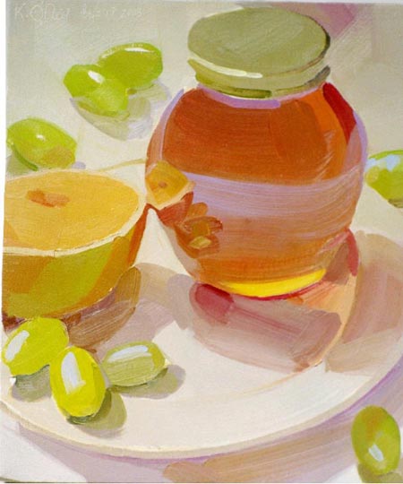
Karen O’Neil’s oil paintings of glassware, china and fruit have some of the characteristics of watercolor and some of the feeling of pastels.

I’m pretty sure O’Neil is working in opaque impasto, but she somehow achieves a bright, airy quality to her paintings that is often seen in transparent watercolor, in which the surface white is transmitted through the paint.

She uses a lot of white objects and background surfaces in her compositions, and her subtle coloring of those surfaces, and the high chroma and high value of her color choices in general, give a feeling sometimes found in pastel, in which pigments are often mixed with white.

O’Neil seems fascinated by transparency and reflection, though by reflection I don’t so much mean mirror-like surfaces as reflected color. Colors bounce from one object or surface to another and back again.

She seems to utilize triadic color schemes and her paintings have an overall color theme to them, within which she is playful in her balance of color areas.

She is forceful and direct in her application of paint, with broad strokes defining forms with deceptive simplicity.

O’Neil is also a teacher and leads workshops and classes at the WailKill River School, The Woodctock School of Art and the Art Students League of New York Vytlacil Campus.

[Suggestion courtesy of James Gurney]

Share or bookmark this post:
  • Digg
  • del.icio.us
  • Facebook
  • Google Bookmarks
  • Mixx
  • Reddit
  • Sphinn
  • StumbleUpon
  • Yahoo! Bookmarks
  • Yahoo! Buzz
  • Twitter
Posted in: Gallery and Museum Art   |  

2 comments for Karen O’Neil »

RSS feed for comments on this post.

  1. Comment by adebanji
    Thursday, August 14, 2008 @ 9:59 pm

    Amazing, never seen Oil colour SO SIMPLE, SO PURE!

  2. Comment by Colin Page
    Friday, August 15, 2008 @ 11:52 am

    Wow, really nicely painted. Beautiful color… almost muted but still really strong. I love these paintings, and the colors are very interesting. This kind of painting makes me more interested in still life… you can see something a little different and exciting in a familiar type of subject.

    Another great find Charley.

Leave a comment

(required)

(required but not published)


For best results, click on article title first, then translate.

Please note that display ads for lines and colors are limited to art related topics and may not be animated.
Exhibitions
Drawing, Illustration and Comics
Updated 1/31/09
Richie Rich to Wendy: the Art of Harvey Comics
Dec 18, 2008 - Apil 18, 2009
Museum of Comic and Cartoon Art, NY
On the Money: cartoons from the new Yorker
Jan 23 - May 24, 2009
Morgan Library and Museum, NY
Artists in Their Studios
Feb 7 - May 25, 2009
Norman Rockwell Museum, MA
American Chronicles: The Art of Norman Rockwell
March 8 - May 31, 2009
Detroit Institiute of Arts, MI
The Wyeths: Three Generations
March 8 - July 19, 2009
Montclair Art Museum, NJ
The Global Artistry of Leo and Diane Dillon
March 28 - June 21, 2008
Akron Art Museum, OH
American Chronicles: The Art of Norman Rockwell
July 4 - Sept 7, 2009
Norman Rockwell Museum, MA
Illustrating Her World: Ellen Bernard Thompson Pyle
Aug 1, 2009 - Jan 3, 2010
Delaware Art Museum, DE
Maxfield Parrish: Illustrated Letters
Oct 17, 2009 - Jan 17, 2010
Delaware Art Museum, DE
Fantasies and Fairy-Tales: Maxfield Parrish and the Art of the Print
Oct 31, 2009 - Jan 10, 2010
Delaware Art Museum, DE


Donate Life

The Gift of a Lifetime