The important thing is to keep on drawing when you start to paint. Never graduate from drawing.
- John Sloan
A man should hear a little music, read a little poetry, and see a fine picture every day of his life.
- Johann Wolfgang von Goethe


Friday, June 26, 2009

Blue and green, or is it?

Posted by Charley Parker at 11:54 pm

Akiyoshi Kitaoka’s A group of green and blue spirals
Like anyone who works with painting, design or color in any form, I occasionally struggle with color; not just with mixing and choosing colors, but with the actual perception of color, the ability to answer the seemingly simple question “What color is that?”

All of my studies of color and color theory have led me to the inexorable conclusion that the single most important rule of color is that the human perception of any color is almost entirely dependent on adjacent or surrounding colors.

This is the basis of Eugene Delacroix’s wonderful quote: “I can paint you the skin of Venus with mud, provided you let me surround it as I will.”

While this principle is visible to the trained eye, both in painting and in life, it is never made more clear than in deliberately created optical illusions, like the e-Chalk color perception illusion I wrote about in this post.

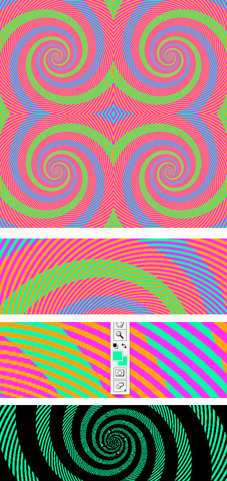
This image shown here is one of the most striking illustrations of this principle I’ve seen.

I came across it in a post by Phil Plait on Bad Astronomy, who indicated the the original is from Akiyoshi Kitaokaâ’s optical illusion website (scroll to the bottom of the page).

Anyone with normal color vision will see a series of green and blue spirals. There would be little chance that a casual observer would suggest that the blue and green might be the same color, and yet they are.

You can see in the first detail image that the “green” spirals are only crossed by bands of orange, and the “blue” spirals are only crossed by bands of magenta.

In the second detail, you can see the Photoshop foreground/background color blocks where I have used the Eyedropper tool to pick one color out of the “green” band, and the other out of the “blue” band.

They are identical RGB values, 0, 255, 150. The same color.

The color is actually a green leaning toward blue. Richard Wiseman used Photoshop to change all of the values except the green and blue bands to black, and you can see a detail of the result in the bottom image. There is also a simplified version of the illusion here.

So the next time you’re looking at a color an think “that’s green” or “that’s blue”, well, maybe it is, maybe it isn’t, depending on the surrounding colors.

Share or bookmark this post:
  • Digg
  • del.icio.us
  • Facebook
  • Google Bookmarks
  • Mixx
  • Reddit
  • Sphinn
  • StumbleUpon
  • Yahoo! Bookmarks
  • Yahoo! Buzz
  • Twitter

5 comments for Blue and green, or is it? »

RSS feed for comments on this post.

  1. Comment by NYstudios
    Saturday, June 27, 2009 @ 5:13 pm

    When I measured the two colors you have they aren’t the same. Close, which I think is the point of the post, but one is:

    RGB: 54-234-137 and in Munsell 4.3G 8.1/11.9

    and the other is:

    RGB: 3-253-170 and in Munsell 7.7G 8.6/11.9

    What I think is important to realize is that these two colors have almost the exact same chroma and nearly the same value, but their hues aren’t the same. 4.3 and 7.7 is a big jump. I think, as you state in your post, color relationships are the hard thing for many people. But here we can see that you can do some interesting things by adjusting the hue and not the value or the chroma.

    Great site by the way! :)

  2. Comment by Charley Parker
    Saturday, June 27, 2009 @ 6:48 pm

    Did you measure them from my JPEGs, or the original image on Akiyoshi Kitaoka’s site?

    The discrepancy may simply be JPEG color shift (an unfortunate byproduct of JPEG compression), but yes the point is that they are not the widely different colors they appear to be.

    Thanks. I’m glad you like the site.

  3. Comment by J.A. Kraulis
    Saturday, June 27, 2009 @ 11:56 pm

    I found the same discrepancy, and you do need to go to the original site. Zooming into the image here to see the individual pixels, you can see that the colors have been corrupted by the compression as Charley points out. The illusion on the site recommended is every bit as strong, and there are other examples equally unbelievable, if not more so.

    Thanks, Charley, for yet another one of your hundreds of fascinating and informative pieces. BTW, I’m a photographer working in Photoshop and other image editing programs, and I often encounter this kind of illusion in real world situations. I’ll have some subtle pastel that I want to intensify, say a rosy tinge in the sky perhaps, but when I try to increase the saturation, nothing happens. A check of the info palette then reveals that the color is actually neutral, or another shade of blue, damn. It just looks pink or peach because of the surround.

  4. Comment by Don Cox
    Monday, June 29, 2009 @ 7:20 am

    This effect is called Assimilation.

    Edwin Land (the inventor of Polaroid) did some very interesting research on the perception of colours being dependent on the surrounding colours. He was able to predict what a colour patch would look like by running a photocell “mouse” across the nearby patches.

    When an image contains less than 256 colours and needs to be sharp, it should be posted as a GIF, not a JPG. This applies to most colour illusions (and to maps, graphs, and diagrams). The JPG process can change colours as well as losing sharpness.

  5. Comment by Charley Parker
    Monday, June 29, 2009 @ 9:51 am

    Thank you.

    My JPEG images were only meant to illustrate the article. Anyone interested in making the comparison in Photoshop should use the original image on Akiyoshi Kitaoka’s site.

Leave a comment

(required)

(required but not published)

 
Display Ads on Lines and Colors: $25/week or $75/month.

Please note that display ads for lines and colors are limited to art related topics and may not be animated.


Donate Life

The Gift of a Lifetime
Exhibitions
Drawing, Illustration and Comics
Updated 5/18/10
Norman Rockwell: Behind the Camera
Nov 7, 2009 - May 31, 2010
Norman Rockwell Museum, MA
Drawings and Prints: Selections from the Permanant Collection
April 21 - July 4, 2010
Metropolitan Museum of Art, NY
An Italian Journey: Drawings from the Tobey Collection, Correggio to Tiepolo
May 12 - Aug 15, 2010
Metropolitan Museum of Art, NY
Defining Beauty: Albrecht Dürer at the Morgan
May 14 - Sept 12, 2010
Morgan Library and Museum, NY
Batman: Yesterday and Tomorrow
Jan 30 - June 6, 2010
Cartoon Art Museum, CA
The Pastoral Vision:British Prints, 1800 — Present
May 15 - Aug 15, 2010
Delaware Art Museum, DE
Earth: Fragile Planet
June 4 - July 31, 2010
Society of Illustrators, NY
German Drawings from the Wolfgang Ratjen Collection, 1580 to 1900
May 16 - Nov 28, 2010
National Gallery of Art, DC