The important thing is to keep on drawing when you start to paint. Never graduate from drawing.
- John Sloan
A man should hear a little music, read a little poetry, and see a fine picture every day of his life.
- Johann Wolfgang von Goethe


Wednesday, October 28, 2009

Chris Ware’s Unmasked

Posted by Charley Parker at 9:06 am

Chris Ware's Unmasked, for The New Yorker
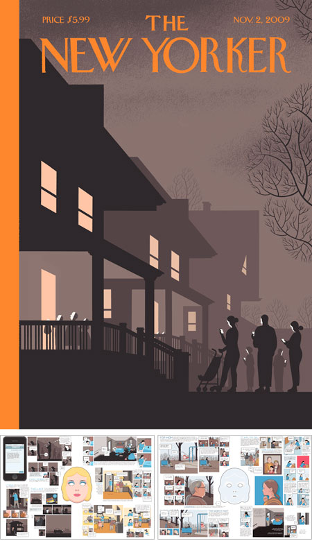
Unmasked is a Halloween themed cover and four page comic story (two double page spreads) for the November 2nd issue of The New Yorker, by Chris Ware.

In a fashion Chris Ware fans have come to expect, the hilarious but subtle cover leads seamlessly into the story, a poignant look at generational and family relations, told in his sublime graphic style.

Ware constructs comics in the way a fine woodworker might construct an inlaid box, crafting each element with refined precision, interlocking elements that might seem unrelated to form a unified whole. Notice the parallels between panels in the second two-page spread, the interweaving of the panel designs with the exterior and interior of the masks and the repeated theme of the phone, carried forward form the cover. Also take note of Ware’s superb control of color and his interesting abandonment of perspective for isometric projection in many panels.

Also note that Ware manages to tell a complete short story in four pages, something many contemporary comics writers can’t seem to do in 6 or more 24-page issues.

Beautiful work.

[Via Daring Fireball]

Share or bookmark this post:
  • Digg
  • del.icio.us
  • Facebook
  • Google Bookmarks
  • Mixx
  • Reddit
  • Sphinn
  • StumbleUpon
  • Yahoo! Bookmarks
  • Yahoo! Buzz
  • Twitter
Posted in: Comics, Illustration   |   6 Comments »

6 comments for Chris Ware’s Unmasked »

RSS feed for comments on this post.

  1. Comment by Daniel van Benthuysen
    Wednesday, October 28, 2009 @ 11:03 pm

    For this reader, his graphic style falls noticeably short of sublime. Whether Ware is typesetting his text or hand-lettering it, I can’t quite tell. What I do know is that his text is frustratingly difficult on my middle-aged eyes (even with recently adjusted perscription lenses.)

    As near as I can tell, his text is the equivalent of about 7 point type. Most magazines like the New Yorker use 9 point type for body copy. Where the New Yorker text might get 7 lines of type in the depth of an inch, Ware squeezes 12 lines. It’s not completely illegible but it’s slow going and frustrating enough that I’ve never made it more than a quarter of the way through anything of his that I’ve encountered. And the type is not just small, it’s too thin in weight.

    Maybe he’s content with a younger audience whose vision is closer to perfect. But he’s unlikely to hang on to those readers as they age.

    Perhaps my frustration with his text also explains why I’m not so impressed that he manages to get a complete story into four pages. He could adopt a microfilm format and get it all into a single page… thereby losing even more readers.

  2. Comment by Charley Parker
    Thursday, October 29, 2009 @ 9:13 am

    Thanks, Daniel.

    Your point is taken about the size of type and panels, but I would be equally impressed if he told a short story in 8 pages. The small elements seem to be part of his overall fascination with detail. The qualities I find most appealing in his work are those that evidence restraint, in color, drawing style and storytelling, in a medium which seems largely based on the absence of restraint.

  3. Comment by bill
    Thursday, October 29, 2009 @ 9:40 am

    I’m going to agree with Charley on this. If the point were to make a completely legible line by line story Mr. Ware would choose a different medium. One of the great things about his work is that people always talk about it, positive or negative. I enjoy things, particularly in the illustration and comics world, that push us to question and ask questions about why while still telling a story and engaging us.

  4. Comment by Antione
    Thursday, October 29, 2009 @ 5:38 pm

    Hmmm… I won’t be as hard on his work as the others. I’m still impressed by the speed I can finish his work and not have it look to bad. But he may want to make it bigger. To many times online comic make their font to small to read.

  5. Comment by Antione
    Thursday, October 29, 2009 @ 7:22 pm

    I agree it is hard to read. But I am still impressed with his speed of doing art work that’s not bad. Maybe if he made it a bit bigger it might get a little more love.

  6. Comment by Marcos Mateu
    Friday, October 30, 2009 @ 3:54 pm

    Fantastic cover.

Leave a comment

(required)

(required but not published)

 
Display Ads on Lines and Colors: $25/week or $75/month.

Please note that display ads for lines and colors are limited to art related topics and may not be animated.


Donate Life

The Gift of a Lifetime
Exhibitions
Drawing, Illustration and Comics
Updated 5/18/10
Norman Rockwell: Behind the Camera
Nov 7, 2009 - May 31, 2010
Norman Rockwell Museum, MA
Drawings and Prints: Selections from the Permanant Collection
April 21 - July 4, 2010
Metropolitan Museum of Art, NY
An Italian Journey: Drawings from the Tobey Collection, Correggio to Tiepolo
May 12 - Aug 15, 2010
Metropolitan Museum of Art, NY
Defining Beauty: Albrecht Dürer at the Morgan
May 14 - Sept 12, 2010
Morgan Library and Museum, NY
Batman: Yesterday and Tomorrow
Jan 30 - June 6, 2010
Cartoon Art Museum, CA
The Pastoral Vision:British Prints, 1800 — Present
May 15 - Aug 15, 2010
Delaware Art Museum, DE
Earth: Fragile Planet
June 4 - July 31, 2010
Society of Illustrators, NY
German Drawings from the Wolfgang Ratjen Collection, 1580 to 1900
May 16 - Nov 28, 2010
National Gallery of Art, DC