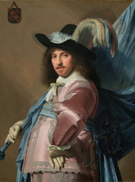
lines and colors :: a blog about drawing, painting, illustration, comics, concept art and other visual arts 2009-07-03T02:00:40Z WordPress http://www.linesandcolors.com/feed/atom/ Charley Parker http://www.zark.com <![CDATA[The Tale of How book]]> http://www.linesandcolors.com/2009/07/02/the-tale-of-how-book/ 2009-07-03T02:00:40Z 2009-07-03T01:57:04Z The Tale of How book
I’ve written before about The Tale of How, a short, wonderfully original animation by The Blackheart Gang, featuring the artwork of Ree Treweek.

I’ve also talked about Shy the Sun, a commercial production company featuring members of the Blackheart Gang, including Treweek and Jannes Hendrikz, which has been producing marvelously eccentric ads for companies like United Airlines and Bakers Precious Biscuits.

Art from The Tale of How, which is planned as part of a larger ongoing project called The Household, has now been published as a coffee table art book, in a deluxe slipcase version that includes a DVD with the animation and reproductions of a print series.

The book is available directly from the Blackheart Gang web site, I don’t know if it will be available in other distribution channels. There are additional images from the book here.

The print series will also be made available for purchase on their site (”soon”).

The original Tale of How animation is visible here, and there is now a short Making of the Tale of How video on the site.

For more on Ree Treweek and The Blackheart Gang, see my previous posts listed below.

]]>
0
Charley Parker http://www.zark.com <![CDATA[Brett Helquist]]> http://www.linesandcolors.com/2009/06/30/brett-helquist/ 2009-06-30T17:30:23Z 2009-06-30T17:29:55Z Brett Helquist
Brett Helquist is best known for his illustrations for the popular A Series of Unfortunate Events children’s books by “Lemony Snicket” (Daniel Handler).

Helquist was born in Arizona, grew up in Utah, where he earned a bachelor’s degree in fine arts from Brigham Young University, and currently lives and works in New York City.

He cites as his inspiration some of the all time great American illustrators like Howard Pyle, N.C. Wyeth and Dean Cornwell (also here).

Helquist’s first job was as an intern for illustrator Robert Neubecker, he then went on to do editorial illustrations for newspapers and magazines. Lemony Snicket’s The Bad Beginning, the first in the series, was his first book illustration assignment.

Since then he has done both cover and interior illustrations for many other books in the series, as well as many in the Tales from the House of Bunnicula series written by James Howe, and cover illustrations for the recent reprinting of the Green Knowe series, along with a number of others. (It’s easy to miss the small navigation to the second page of his portfolio.)

In addition, Helquist is both the author and illustrator of Roger, the Jolly Pirate (above, bottom, right).

]]>
3
Charley Parker http://www.zark.com <![CDATA[Joseph Zbukvic]]> http://www.linesandcolors.com/2009/06/29/joseph-zbukvic/ 2009-06-30T15:13:34Z 2009-06-29T19:07:19Z Joseph Zbukvic
Joseph Zbukvic is a Croation born artist living and working in Melbourne, Australia.

Zbukvic’s atmospheric, emotionally resonant watercolors have a wonderful characteristic of being simultaneously loose and crisp — loose in that he suggests rather than elaborating, and crisp because of his masterful command of edges. He has a highly refined sense of when to define a sharp edge, and when to let an edge disappear into mists of hazy textured color.

His landscapes and cityscapes, often of locations in Europe, are highly evocative of the place, without being rigid in their portrayal of details and specifics. He portrays the kind of visual image we might call up as a memory of a fondly remembered place, both hazy and sharp.

Many of Zbukvic’s paintings are done on location. His palette is often muted and understated, though sometimes punctuated with higher chroma passages. Zbukvick enjoys dwelling on misty atmosphere, rain and overcast shadow, as well as the haze of bright sunlight.

Zbukvick gives highly regarded workshops. This year’s schedule includes dates in France, Spain and Canada as well as Australia. His DVD, Watercolor Impressions, includes scenes from previous workshops; you can see a short excerpt by clicking on the second image on the workshop page.

I also came across this video clip from Inside Joseph Zbukvic’s Sketchbook, related I think to a June, 2008 cover story on him in Watercolor Artist magazine.

In addition to his workshops, Zbukvick also teaches at Charles Sturt University and the Mitchell School of Arts.

Some of the galleries that represent his work have additional galleries in which you will find images not on his site (and/or larger reproductions, particularly the first two listed).

[Suggestion courtesy of Jeroen Coert]

Addendum: Adebanji Alade wrote to let us know about Zbukvic’s book Mastering Atmosphere & Mood in Watercolor: The Critical Ingredients That Turn Paintings into Art. Unfortunately, it is out of print and resellers seem to be asking high prices for it at the moment. Perhaps something to keep an eye out for.

]]>
7
Charley Parker http://www.zark.com <![CDATA[Blue and green, or is it?]]> http://www.linesandcolors.com/?p=1592 2009-06-27T04:17:33Z 2009-06-27T03:54:39Z Akiyoshi Kitaoka’s A group of green and blue spirals
Like anyone who works with painting, design or color in any form, I occasionally struggle with color; not just with mixing and choosing colors, but with the actual perception of color, the ability to answer the seemingly simple question “What color is that?”

All of my studies of color and color theory have led me to the inexorable conclusion that the single most important rule of color is that the human perception of any color is almost entirely dependent on adjacent or surrounding colors.

This is the basis of Eugene Delacroix’s wonderful quote: “I can paint you the skin of Venus with mud, provided you let me surround it as I will.”

While this principle is visible to the trained eye, both in painting and in life, it is never made more clear than in deliberately created optical illusions, like the e-Chalk color perception illusion I wrote about in this post.

This image shown here is one of the most striking illustrations of this principle I’ve seen.

I came across it in a post by Phil Plait on Bad Astronomy, who indicated the the original is from Akiyoshi Kitaoka’s optical illusion website (scroll to the bottom of the page).

Anyone with normal color vision will see a series of green and blue spirals. There would be little chance that a casual observer would suggest that the blue and green might be the same color, and yet they are.

You can see in the first detail image that the “green” spirals are only crossed by bands of orange, and the “blue” spirals are only crossed by bands of magenta.

In the second detail, you can see the Photoshop foreground/background color blocks where I have used the Eyedropper tool to pick one color out of the “green” band, and the other out of the “blue” band.

They are identical RGB values, 0, 255, 150. The same color.

The color is actually a green leaning toward blue. Richard Wiseman used Photoshop to change all of the values except the green and blue bands to black, and you can see a detail of the result in the bottom image. There is also a simplified version of the illusion here.

So the next time you’re looking at a color an think “that’s green” or “that’s blue”, well, maybe it is, maybe it isn’t, depending on the surrounding colors.

]]>
5
Charley Parker http://www.zark.com <![CDATA[John Pugh]]> http://www.linesandcolors.com/?p=1589 2009-06-26T04:39:27Z 2009-06-26T03:36:48Z John Pugh
Trompe l’oeil, French for “trick the eye” is an illusionary art technique with a long history in Western art. The intention is to create an optical illusion, in that the viewer is given the impression that there is a three dimensional object or scene before them, not just a realistic image (see some of my posts relevant to trompe l’oeil, in particular my post on Eric Grohe).

California born artist John Pugh paints large scale trompe l’oeil images, usually on the sides of buildings, that reveal impossible, and often amusing, dimensions to an otherwise flat wall.

In his Mana Nalu (power of the wave) Mural Project (image above, top, large version here) in Hawaii, the flat side of a building appears to be deeply concave, and filed with an enormous cresting wave, in which we see a personification of Queen Lili’uokalani. Riding the wave is pioneering surfer Duke Kahanamoku, and standing at the foot of the wave, looking for all the world like real children walking on a ledge in front of the oncoming wall of water, are three painted children.

Pugh likes to give our sensibilities an extra tease at times by including a painted observer in his illusionary scene.

In his Siete Punto Uno in Los Gatos, California (image above, bottom, large version here), a red jacketed woman peers into an apparently earthquake caused break in the wall of a cafe, that reveals a hidden temple of the Mayan Jaguar God (the bringer of earthquakes in their mythology).

Pugh’s web site showcases his mural work, public and residential and corporate. It also includes a page of “mural mishap” accounts, in which the illusion of the murals has prompted amusing responses from people, such as patrons in a bar who break glasses trying to set them on trompe l’oeil “shelf”, or people who walk into walls trying to walk “into” his paintings, a la Road Runner cartoons.

In addition to his site, Pugh maintains a site for prints and mural posters that also has galleries of images.

[Via Daily Mail Online]

]]>
4
Charley Parker http://www.zark.com <![CDATA[Juan Gallego]]> http://www.linesandcolors.com/?p=1587 2009-06-25T04:05:21Z 2009-06-25T03:44:10Z Juan Gallego
Spanish painter Juan Gallego paints images that are technically floral paintings, though they are unlike any I have seen.

Gallego take his inspiration in close-ups of flower forms that are convoluted, multi-layered and often have a wrinkled or withered appearance.

These are the basis for his large scale compositions (it’s instructive to see a photo of an exhibit to get sense of their size), that border on abstracts. but retain their recognizable forms.

He apparently uses photographic reference, and deliberately plays with the illusion of focus in areas of his canvasses, giving them both depth and and compositional structure, demanding that your eye find his intended center of interest.

Gallego often provides several detail images to accompany the paintings he posts on his blog, in which you can see the painterly handling of the surface, something that would be hard to see in the smaller images. Also, most of the images in the blog, including the detail images, can be clicked on to see a higher resolution version.

He doesn’t seem to update often, but there is enough on the blog to get a good feeling for his work. In the image above, the whole composition at the top shows its painterly characteristics in the detail below it, which is taken from the right hand side of the painting, about a third of the way down.

]]>
2
Charley Parker http://www.zark.com <![CDATA[Peter Gric]]> http://www.linesandcolors.com/2009/06/23/peter-gric/ 2009-06-24T04:18:23Z 2009-06-24T03:59:12Z Peter Gric
Born in the Czech Republic, Peter Gric emigrated to Austria at the age of 12, and studied at the Academy of Arts in Vienna.

His paintings are representational, but they largely depict imaginary objects or landscapes, that can at times seem architectural, at times organic and at other times, a combination of the two.

Gric paints in acrylic and sometimes oil, and uses computer graphics and 3D software to help visualize and work out perspective and compositional problems before, or even while painting.

His structural imaginings can take curvilinear forms that seem to be obeying some hidden geometry, as if some stone-like material was assembling itself along invisible lines of force.

Other images show the apparent dissolution of structures or material formations, with walls or cliffs dissolving into a gravity defying shower of stone blocks. His paintings sometimes include female forms that are apparently made of stone and either dissolving or gathering themselves together from inorganic elements.

Gric’s website has his paintings arranged by year, so you can browse back through some of his previous explorations of similar and disparate themes.

There is also a shop with prints of images from various times. Gric has also illustrated a number of book covers, largely in the science fiction genre, and you can see some of them in the “Other Projects” section of his site.

There is a gallery for Gric’s paintings on the beinArt Surreal Art Collective, which is where I encountered his work, as well as an interview with the artist. He is also featured in the first volume of the Collective’s Metamorphosis collections (see my post on Metamorphosis, Volume I).

]]>
3
Charley Parker http://www.zark.com <![CDATA[J.W. Waterhouse: The Modern Pre-Raphaelite]]> http://www.linesandcolors.com/2009/06/22/jw-waterhouse-the-modern-pre-raphaelite/ 2009-06-23T02:32:43Z 2009-06-23T02:31:57Z John William Waterhouse
For those familiar with the English Pre-Raphaelite painters, the phrase “modern Pre-Raphaelite” may sound as much an oxymoron as the Surrealist phrase “Soluble Fish”, in that the Pre-Raphaelites named their group after their desire to return to the “pre-Raphael” purity of the early Renaissance.

John William Waterhouse was never a member of the Pre-Raphaelite Brotherhood, he wasn’t born until the year of their first exhibition, but he was very much influenced by them, took on many of the same literary themes in his paintings and is often associated with them from the perspective of a century and a half into the future.

Unlike the Pre-Raphaelites, who made a point of breaking away from the Royal Academy and deriding it’s leadership, Waterhouse was completely comfortable with the Academy and was active as a member.

For all of his classical training and Pre-Raphaelite leanings, Waterhouse was indeed modern in his time, particularly in his later work, when he moved away from his more tightly controlled early style, somewhat in the vein of Sir Lawrence Alma-Tadema and other romantic history painters, toward a more open and lively handling of paint.

Influenced though he was by the Pre-Raphaelite painters in subject matter and emotional tone, Waterhouse differed in his approach to painting, specifically eschewing the detailed techniques that Millais at one point complained took a whole day painting an area “no larger than a five shilling piece”, and embracing instead the painterly, open brushstrokes of the French Impressionists and the English painters who had taken up their style. Not that Waterhouse painted in an Impressionist manner, but more of a lively synthesis of Academic and Impressionist inspired techniques, a sort of painterly and richly colored academic classicism.

If Academic painting, plus Pre-Raphaelite literary romanticism plus Impressionist color and brushstrokes sounds like an improbable combination to you, the images above, and many others, will attest to its success. Waterhouse is not only a favorite of mine, but of millions. His images are among the most popular and frequently reproduced in the canon of Western art.

J.W. Waterhouse: The Modern Pre-Raphaelite is an exhibition organized by the Groninger Museum, the Netherlands in cooperation with the Royal Academy of Arts and the Montreal Museum of Fine Art. It is the first major international exhibition of his work, and includes eighty painting and numerous drawings.

J.W. Waterhouse: The Modern Pre-Raphaelite is at the Royal Academy of Arts from June 27 to September 13, 2009, and will be at the Montreal Museum of Fine Arts from October 1, 2009 to February 2, 2010.

There are numerous books on Waterhouse, including a new one that accompanies this exhibition. I haven’t seen that one, but I can recommend J.W. Waterhouse by Peter Trippi. The latter volume, while perhaps not the most luxurious with illustrations, shows a curator’s keen eye in their selection and accompanies them with well thought out text that gives them a depth and artistic history many art books lack.

I don’t know if the images I’ve chosen above have any relation to the exhibition, I’ve just picked them to be representative of Waterhouse, both in his most familiar and somewhat lesser known forms.

For more, see my previous posts about John William Waterhouse and The Pre-Raphaelites.

[Via Art Knowledge News]

]]>
0
Charley Parker http://www.zark.com <![CDATA[Mattias Adolfsson]]> http://www.linesandcolors.com/2009/06/20/mattias-adolfsson/ 2009-06-20T14:51:41Z 2009-06-20T14:47:34Z Mattias Adolfsson, Star Wars,the baroque version, houseflower
Mattias Adolfsson, skyscraper prototypeMattias Adolfsson is a 3D artist living outside of Stockholm, Sweeden and currently working for gaming developer Simbin Development Studios.

Having apparently put aside traditional drawing for a while, Adolfsson returned to regular drawing when he started his sketchblog Mattias Inks, in 2006. Since then he has populated it with a wonderful and fast growing assortment of whimsical drawings on a variety of subjects and themes.

Usually drawing with a Namiki Falcon fountain pen and Noodler’s American Eel ink, and often in the pages of Moleskine sketchbooks, Adolfsson draws charmingly offbeat characters, animals, robots and architectural fantasies, as well as more straightforward sketches of his surroundings.

He often fills out his drawings with watercolor to varying degrees, usually with light touches that leave the feeling of the ink drawing intact.

For someone who has only been drawing recently for a couple of years, Adolfsson has been prolific; his Flickr galleries go on for dozens of pages.

He also has a web site with galleries of his drawings, doodles and sketch books; as well as an Etsy shop in which he sells original art.

One of his excursions into fanciful imaginings is his interpretation of “Star Wars, the baroque version” (expanded page version here), with a curly-wig helmeted Darth Vader, blunderbuss and balloon-pak equipped Bobba Fett, and Han Solo being harassed by the puritan police at the base of his eminently baroque Millennium Falcon (top, left).

I particularly enjoy Adolfsson’s architectural imaginings, like his houseflowers (top, right) and ornate, leaning, single-room-stacked “skyscraper prototypes” (left).

Mattias Adolfsson is giving a workshop in drawing this July 29-31 (more information here, in Swedish); and is currently working on a children’s book titled Till mitt barnbarn.

[Via 'skine art]

 
]]>
2
Charley Parker http://www.zark.com <![CDATA[Clark Hulings]]> http://www.linesandcolors.com/2009/06/19/clark-hulings/ 2009-06-19T05:03:05Z 2009-06-19T05:02:44Z Clark Hulings
In addition to receiving a degree in physics from Haverford College in 1944, and an appointment to work on the Manhattan Project in Los Alamos, Clark Hulings studied art with George Bridgeman (whose books on anatomy are among my favorites) and influential teacher Frank Reilly (see my post on Frank Reilly) at the Art Student’s League in New York.

Health issues prevented Hulings from joining the atomic bomb project and he turned to his love of art for his career.

He started in portraiture, but the demands of sitters made him more inclined to a career in illustration. Even as he established a successful career as an illustrator, his desire to pursue easel painting, particularly landscape, led him to study in Florence, Italy for three years, and on his return to the U.S. he pursued landscape painting while continuing his illustration career.

Hulings eventually transitioned from illustration to gallery painting full time. He became an accomplished and well respected painter. His careful observations and tonally complex compositions make for evocative images from his travels across the globe, but particularly shine in his portrayals of rural Mexican village life, from colorful markets to humble shelters to quiet domestic scenes.

Hulings’ paintings interweave patterns of light, often brilliant white against walls and the sides of buildings, with areas of more subdued contrast that are rich with visual texture.

The intricate interplay of light and texture, and his attention to visual detail, can make his paintings seem tighter than they actually are when seen in reproduction, an impression that is unfortunately not dispelled by the small images on his own site and elsewhere on the web. However, if you take a look at the zoomable image of this painting on the Sotheby’s auction site, you can see the actual loose and painterly quality of his work.

Also unfortunate is the fact the the Flash slideshow on the Painting Gallery section of his web site doesn’t function properly (image sections overlap and cover other sections); however there is an older Image Gallery still linked from the Contact page, that is more straightforward.

There also images on the Store page. In addition, there are books and DVDs available directly from his web site; and others, some out of print, available from sources like Amazon.

There are a few videos on YouTube and Hulings’ Facebook page that are audio excerpts of his lectures at the Art Students League, as well as an additional gallery on Facebook.

[Suggestion and links courtesy of James Gurney]

]]>
1