Color Vision & Art is an online feature on WebExhibits, which describes itself as an “interactive museum of science, humanities and culture”.
The feature is a series of related articles, accompanied by images and simple Flash interactives, that explore the relationship of human color perception to the uses of color in art. The feature is more extensive than it appears first, each section divided into secondary and sometimes tertiary levels of topics.
The articles move from basic information about light, color and vision, through color theory and the color wheel (additionally, see my post on History of the Color Wheel), paints and pigments (for which there is a dedicated feature on WebExhibits, Pigments Through the Ages) into color interactions and peripheral vision. The latter has some interesting essays on the use of detail and blurring in paintings at various points in art history.
I found the section on Color Interactions Simultaneous Contrast a little spare, as I feel this is at the core of understanding and using color, and could have benefitted from additional interactions and demonstrations, (particularly demonstrations such as the striking examples of simultaneous contrast shown by modern color perception demonstrations like the ones I wrote about here and here).
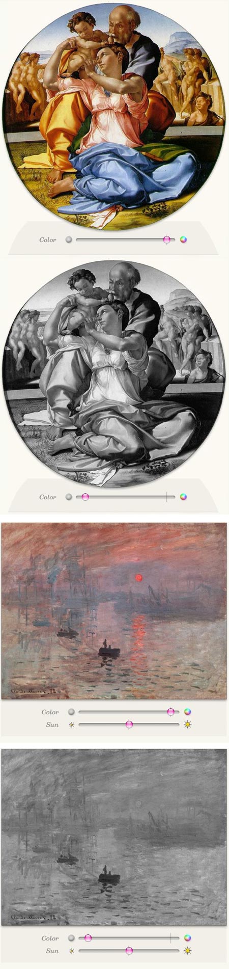
However, I found particular interest in the section on Luminance and equiluminance, or value contrasts and value similarities. This is illustrated particularly well in simple interactives that use sliders to remove the color and show the strong value relationships in Michelangelo’s Doni Holy Family and the very different ones in Monet’s Impression: Sunrise. The latter is the painting from which the term “Impressionism”, originally a bit of derisive mockery by critics, came into use.
The interactives allow you to gradually remove the color from both paintings, viewing the difference in their color contrasts and value contrasts. (The images above are just screen captures and are not interactive.)
Most fascinating is the combination of deliberate lack of value contrast and simultaneous strong color contrast in the key parts of Monet’s painting, also demonstrated in his Poppies, near Argenteuil, producing a conflict in the perception of the contrast within the brain that makes the area seem to vibrate.
Overall, the features are, if you will excuse the expression, illuminating, and well worth both casual perusal and more dedicated reading if you have the time.
Other features in WebExhibits of particular interest to Lines and Colors readers include Causes of Color, Pigments Through the Ages, Bellini’s “Feast of the Gods” and Van Gogh’s Letters.
The term equiluminance as the authors use it, is a bit misguiding. For them, it means area(s) of equal both chroma and value. It is obvious though, that poppies in Manet’s painting have the same (or very similar) value as the field, but much higher chroma, and THAT makes the area seem to vibrate.
The expression, and understood literary thought that engages my eyes and mental awareness is greatly appreciated for what you have brought forward. As I look into the impressionist, I was inclined to become acutely aware there was more within the context of the artist paint brush.
Being dutifully explained not only defining for me words to enlighten my depth of perception but engage me to enjoy this masterpiece of art. Thank you!