Eye Candy for Today: Anders Zorn portrait etching

Gulli II, Anders Zorn, etching
Gulli II, Anders Zorn, etching (details)

Guli II, Anders Zorn, etching, roughly 8 x 5 1/2 inches (20 x 15 cm). Link is to Bukowski’s auctions, which has a large image available from their page. I assume that the original of this particular impression is now in a private collection.

The etching is called Gulli II because the artist did a previous portrait etching of the same young woman, titled Gulli I. (Here is a print of that one in the Metropolitan Museum of Art.)

Anders Zorn, a remarkable Swedish painter who was active in the late 19th and early 20the centuries, is known for his beautiful portraits and genre scenes, as well as for his eponymous limited palette. He is less well known as a printmaker, but unjustly so.

In my opinion, he was among the best etchers in history, wielding his etching and drypoint needles with a simultaneous freedom and accuracy matched by few.

Look at the flurry of lines that make up the shading on the face — seemingly applied with casual abandon, some of their ends hooked with the sweep of the needle — then scroll back to the normal view and see how smoothly they blend into the delicate values of this sensitive portrait.

Even on the cheek on the shadowed side, where it appears that strokes have landed close to others, emphasizing some lines perhaps more definitively than he might have wanted were he trying to smooth out the tone more evenly, he still pulls off a rendering of the form that is believable.

I have to think that his hatching was done with quick strokes, aiming to capture the feeling rather than allowing caution to weigh down the effect of spontaneity.

Notice also, how few lines he has used to create the planes of the lit side of the face, and yet how definite the form is.

Despite the number of etched lines that make up this image, there are few, if any, that can be called outlines — even in the edges of the light and dark sides of the scarf where it meet’s the woman’s forehead.

Look at how the lips are formed. He’s etching like a painter.

For more, see my previous post on Anders Zorn’s etchings, as well as my other posts about Anders Zorn.

Guide to Virtual Museum Resources

The Museum Computer Network (MCN) has published a guide to online virtual museums and related resources: The Ultimate Guide to Virtual Museum Resources, E-Learning, and Online Collections, that should provide art lovers who are at home with time to browse a cornucopia of time sinks.

Divided into sections like “Portals”, “Virtual Tours / Online Exhibits”, “E-Learning”, “Online Collections” and “Digital Archives & Libraries”, the list of links is being updated on an ongoing basis.

(I’ll also point out that Lines and Colors has 15 years of archived posts, most of which contain multiple links to art resources. See the Categories or Archives links in the left hand column.)

Enjoy!

[Via Delaware Art Museum]

NRM Illustration History resource and archive

NRM Illustration History resource and archive
Since its inception, the Norman Rockwell Museum in Stockbridge, MA has sought to expand its focus from a single artist to a relevant context and then more broadly to illustration in general.

In that spirit, the museum, through its associated Rockwell Center for American Visual Studies, has just launched a new web-based project: Illustration History: An educational resource and archive.

The intention appears to be the assembly of a large and sweeping overview of the illustration field, as seen in multiple aspects — a noble and ambitious goal.

The site has a section on history, seeking to put the whole in context, with increments of half-centruries or individual decades, but the primary focus of the site is on individual artists and genres.

The artist listings can be searched or browsed. Individual artist articles include an attempt to put them in context by linking to related artists and time periods; and there are selections of their work accessed from small thumbnails at page bottom. There is a promising mix of both historic and contemporary illustrators.

You can also browse through genres, or a master list of individual illustrations. Each illustration accessed that way has its own page, with medium, support, size and collection location when available. (Note that the “mobile-friendly” design of the website limits the size of the images on pages to the size of your browser window.)

There are also essays and a selection of links to resources, including artist interviews, blogs, books, museum collections and illustration schools.

The design has a few quirks to be worked out, but for the most part the designers have done a good job of bringing the subject matter forward (with the glaring exception of the obligatory social media buttons, which are not only unnecessarily repeated, but are intrusive and persistent to the point of being a genuine annoyance).

The selections and genres are a bit sparse yet, with few images and many glaring holes to be filled, as well as some odd inclusions. Ben Franklin is listed, for example, but there are no entries for Arthur Rackham, Edmund Dulac or other major European figures. I can only assume that the museum is starting at home with their own resources, which focus primarily on American illustration, and will expand out from there.

The project is in its nascent stages, and what we see is more the form of what will come, a field of saplings, as it were — but the site is certainly worth visiting at this point, and following as it develops.

Illustration History promises to be a wonderful resource.

[Via Gurney Journey]

10 years of Lines and Colors

10 years of Lines and Colors
Today marks the 10th anniversary of my first post on Lines and Colors, on August 22, 2005.

My initial intention for the blog — which you can read more about here — is still basically the same: to introduce my readers to wonderful art and artists that they may not be familiar with, or to point out something of interest about more well-known artists.

The artwork I feature is in a broad variety of genres, but tied together by two common factors — I personally like it, and it’s more or less within the traditions of representational realism. Other than that, as I’ve always said in the blog’s capsule description, if it has lines and/or colors, it’s fair game.

You can see some of the range of genres in the “Categories” listing in the left hand column, and below that, in the “Archives”, you can still read all of the posts I’ve added over the past ten years. (Well, almost all — I still need to restore about 10 posts from July of 2013 that were “misplaced” when I moved the blog from one server to another — it’s constantly a work in progress.)

My most popular single post to date, at least in terms of response and comments, has been “How Not to Display Your Artwork on the Web“.

The images I’ve selected above are meant as a small sampling of what you may find in the archives.

It has always been my hope that those interested in a particular genre of art — like traditional painting, plein air, art history, comics, concept art, fantasy art or illustration — would be drawn to Lines and Colors to pursue their area of interest, and through it discover wonderful art in other genres that they may not have sought out or encountered otherwise. I see that aspect of what I’m doing as an attempt to gently counter the ever-increasing fragmentation of art interests on the web.

In the 10 years since writing my first article for Lines and Colors, the resources for art images on the internet have expanded dramatically, most notably in the form of major museums, such as the Metropolitan Museum of Art, the Smithsonian and the Rijksmuseum, posting high-resolution images from their collections online; the appearance of remarkable resources like the Google Art Project; and new online destinations for illustration, comics and concept art.

Originally, my posts were short, and the images single and small, and I actually worried that I would run out of “favorite artists” to write about. Today, after more than 3,400 posts (not quite a post a day for ten years, but pretty close), I have an ever-growing list of potential topics to get to — that may actually be longer than the list of already written ones.

There’s more to come!

-Charley

Google Art Project changes

Google Art Project changes
Let me start by saying that I have been a fan of the Google Art Project pretty much since it’s inception in February of 2011 — because I love, love, love high resolution art images — just love ’em! (love ’em!), and the Google Art Project has delivered them — in ever increasing numbers.

Admittedly there has been some inconsistency in size and some lapses in quality, but overall they have done a splendid job of putting our noses right up to some of the world’s great works of art, along with offering virtual tours of many of the museums in which they’re housed.

When they expanded, reorganized and streamlined the site in 2012, I was right on board. Every change they made was a much needed improvement.

Google has just released a new round of revisions to the project, and at the risk of looking a gift horse in the mouth, I have to say I’m not entirely enthused this time around.

First of all, the Google Art Project no longer exists as an independent entity; it has been subsumed into the more ambitious “Google Cultural Institute“, which evidently seeks to cover all aspects of culture (and perhaps, eventually, All Knowledge — who knows?)

So now, instead of the Google Art Project we apparently have the Google Cultural Institute: Art Project, and in place of googleartproject.com, we have google.com/culturalinstitute/project/art-project (though I will give the tech team credit for keeping incoming links intact).

It just seems like an unnecessary sidelining and de-emphasizing of the Art Project, and of course, I think such a great destination for online art images should be made more prominent, not less.

Google has made interface changes to the Google Art Project Google Cultural Institute: Art Project — some I think are indeed for the better, others… not so much.

The overall interface is now soft gray with black or dark gray navigation bars, making text easier to read and the navigation areas more prominent, and some navigation features are better organized.

The layout of the Collections and Artists listings is simultaneously improved — by a selection of thumbnail images next to each item in the list — and made more awkward — by a selection of thumbnail images next to each item in the list, without the ability to leave out the thumbnails and streamline the list to just text for easier scrolling.

The need to load thumbnails and the “endless list” style of layout make the list of museums so awkward to browse it’s essentially unusable unless you choose to filter the list — not a good browsing model.

(Is it just me? Am I the only one who finds this now seemingly universal paradigm of infinitely scrolling pages updated with JavaScript, in lieu of actual separate pages that can be individually linked to and bookmarked, not only unnecessary but annoying?)

Filtering the list is up to you; you have to guess at some filters. They say “Begin typing to filter partners [i.e. museums] or countries” and the only actual built-in filter they give you is on the other side of the page in the form of a choice between list and world map view.

The Artists list is likewise not conducive to browsing unless you’re actually searching by name.

An attempt to filter for “19th century” returned nothing; a filter for “France” returned only an entry with the word “France” in the name, and filtering or searching for “Courbet still life” returned lots of items that were neither. Typing in “b” did not filter the list for artists whose names began with the letter, so that previously available feature is gone along with other useful interface items. Maybe they need to partner with a company that’s experienced with search…. oh, wait.

The “Artworks” tab yielded somewhat better results, with at least a scrollable text based list of museums, but still doesn’t encourage the kind of casual browsing by which unexpected discoveries are made.

The entire interface is still too widgety, too reliant on JavaScript and too likely to be clunky and problematic in browsers other than Google’s own Chrome.

It also suffers from design for the illusion of simplicity at the expense of clarity.

As a case in point, the list for Collections (i.e. museums) at first appears to be without discernible order, until you scroll far enough to realize that is is primarily alphabetical, but with new entries in the first several places. With no indication of their function other than a mouse-over tool tip, these are set off with diagonal corner stripes (you know — the universally understood symbol for “new entries that are out of sequence from the main list”).

The big sliding image view, which is the default when viewing Collections, doesn’t function correctly, even in Chrome (for Mac), in that an item partially visible to the right is not moved into full view by the use of the advance arrow, but instead maddeningly slides past the center of the screen and under the filter/collection list on the left! WTF?
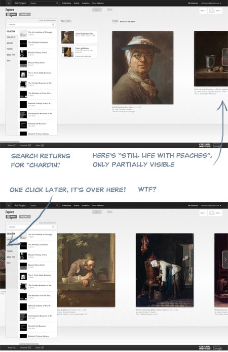
Google Art Project changes

I signed in to my account (free, and worthwhile for saving galleries) and under “My Galleries” my saved galleries were waiting for me, custom zoom levels intact, but without the convenient row of thumbnails at page bottom that made them previously easier to browse. This area is now apparently set aside for temporarily dropping items to be added to custom galleries, a process that is less straightforward than before.

The actual high-resolution image view is not radically changed; the background is gray instead of black, controls have been moved around and the containing window is now full browser height with overlays, but it’s essentially the same, and even feels a bit smoother and easier to zoom and scroll.

To be fair, creating and maintaining an amazing resource like this like this costs money, and I’m asking for a lot by being cranky about the interface, considering I’m not paying anything directly for the privilege of access. Google is not doing this out of altruism and a love of art, but as promotion for all things Google, and that’s fine.

Corporate world domination and the end of privacy is a small price to pay for access to high resolution art images (frighteningly, part of me means that), and the Google Art Project Google Cultural Institute: Art Project is still a treasure trove, an amazing destination for art lovers and still more than worthy of my Major Time Sink Warning.

Round two of the site was a distinct step up over the first version, and if round three is a bit glitchy, I can live with it while I wait for round four, as long as all those yummy high res images are available.

Interface hiccups aside, I feel the site is still deserving of even more attention and a wider audience, which is why I think submerging its identity into a mere sub-section of a monolithic “Cultural Institute” is an unfortunate choice.

Given Google’s propensity for growth, I’m just hoping the next round of revisions doesn’t leave art lovers digging through the Google Central Repository for All Information: Complete World Knowledge Registry: Humanities Data Bank: Cultural Institute: Art Project just to get to our fix of high-res Rembrandts.

ArtBabble relaunch

Art Babble
Longtime Lines and Colors readers may have noticed my tendency to be cranky about art museums that are seemingly without clue in their approach to using their website to best advantage (though I take great delight in pointing out those who are using them well, as in the case of the Metropolitan Museum of Art and the recent makeover of the Rijksmuseum website).

It’s sometimes not for lack of trying. Museums often put effort into producing articles, interactives, videos and other projects in various media aimed at engaging their audience and encouraging people to be more informed and involved in the appreciation of art and art related topics.

Short documentary video, in particular, is an area into which a number of art museums have put time and energy, whether accompanying particular exhibits, highlighting collections, exploring topics related to conservation and curation or simply general forays into art history.

ArtBabble, which I mentioned not long after its initial launch back in 2009, is a website produced by Indianapolis Museum of Art (whose own website I praised here) that provides a centralized source for browsing and viewing short video productions about art related subjects by a number of partner museums.

The site has just been relaunched after a major redesign, with a more efficient and elegant interface, better search features and an expanded variety of browsing paths. You can browse videos by themes, medium, period and style, location, people and more, including a list of artists.

Pages within a particular category are accompanied by an excellent set of sub-menus on the left sidebar of the other subcategories at the level you’re browsing.

I actually find the Partner Channels page, which features the growing list of participating institutions, to be one of the most fruitful sections from which to browse. I find that some museums produce materials more of interest to me personally than others.

What’s still missing is a more sophisticated search feature, with options for narrowing your search, though the current one does make provisions for filtering your results. You can also filter pages that offer browsing within topics.

Most of the videos are professionally produced to one degree or another. Many simply take the form of curators, conservators and other museum staff commenting on particular works. Others delve into the process of a particular medium, like the Museum of Modern Art’s short series “Pressure + Ink: Introduction to Printmaking“. The videos on mediums and techniques are generally overviews and not specifically instructional.

Some of the videos are aimed at engaging children in looking at art, and there is a video type “For Kids” that will let you filter for them; though I don’t see a way to filter them out of the results (which would be convenient).

Also, though most of the videos are in English, a number are in various languages (sometimes with subtitles). These are usually from particular museums (e.g. Prado, Van Gogh Museum).

A few of the features are longer, such as the series of recorded lectures “Wyeth Lecture in American Art” from the National Gallery, Washington.

How fascinating you find the kinds of videos offered will, of course, vary depending on your interests, but if you like them, the Art Babble site, particularly in it newly energized form, is a cornucopia of short documentary art videos and worth a Timesink Warning.

(Images above: Art babble interface; Dallas Museum Of Art Collection: The Seine at Lavacourt by Claude Monet – Dallas Museum Of Art; The Landscape Painter Martín Rico – Prado, Madrid; Pressure + Ink: Introduction to Printmaking – MoMA; Vincent Van Gogh In Paris: Montmartre – Van Gogh Museum, Amsterdam; Conserving Norman Rockwell’s “United Nations” – Norman Rockewll Museum; Wyeth Lecture In American Art: Ground Swell: Edward Hopper In 1939 – National Gallery, Washington)